Freedom to Ride
Imagine the thrill of cycling—the wind in your face, the world stretching out ahead—only to be stopped short by the overwhelming task of finding the right bike. For too many riders, the joy of the journey is overshadowed by frustration with confusing product comparisons and tedious checkout processes.
3Free, an e-commerce bicycle company, believes buying a bike should be as liberating as the ride itself.
Through user-centered design, I tackled the challenges cyclists face online, creating tools to simplify bike comparison, streamline checkout, and reflect 3Free’s deep expertise in the cycling world. The result? A mobile web experience that empowers riders to choose confidently, shop effortlessly, and focus on the freedom of the road ahead.
Deliverable
Company
Year
My Role
Mobile Website
Educational
2024
Sole UX/UI Designer
Type
Tools
Methods
Lean UX
Figma
Adobe Illustrator
Squarespace
Research & Strategy
Experience
Interface
Prototyping
Testing

Brief | Conversation
Talking through the ride
The project focused on improving the mobile web experience for an e-commerce bike company, aiming to boost usability and sales. The goal was clear: make browsing and checkout smoother to turn more casual visitors into paying customers. By focusing on these areas, the company aimed to increase revenue while creating a better, more satisfying experience for users.
To focus my time without getting too far off track, I clarified the constraints of the business insights.
Browsing Drop-off
50% of users explore an average of 7 bike pages but leave without adding anything to their cart. This suggests they’re struggling to decide which bike suits them best based on features.
Checkout Abandonment
70% of users who add items to their cart don’t complete their purchase, with most abandoning the registration page. The mandatory account creation is likely a key roadblock.
After receiving the brief, I had a casual conversation with a friend and lifelong bicyclist. The conversation was so helpful that I had to write down this quote.
“There’s really nothing like the thrill of riding my bike; it’s the ultimate freedom. It’s just me, the open road, and endless possibilities. Each ride brings new adventures and discoveries. It clears my mind, it fills me with peace and happiness like nothing else.”

Project Start
Sketching out ideas
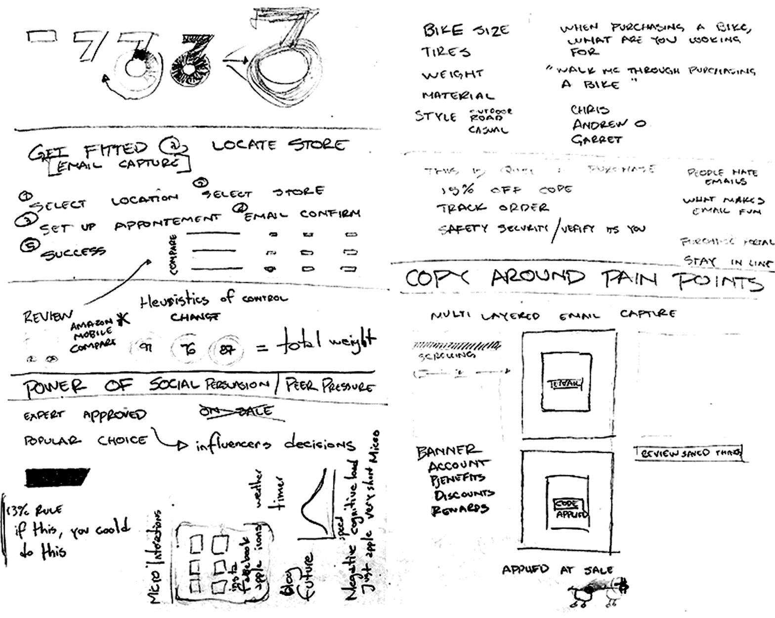
I started with sketches to visualize the problem space and explore solutions. It helped me see the big picture, work through ideas, and refine initial thoughts without overcommitting too soon.
Competitive Analysis
Competitive analysis revealed key takeaways to enhance this company’s mobile shopping experience. A simplified checkout and a clean product page with clear promotions, Personalization, user reviews, and high-quality visuals could build trust and create a seamless, engaging user journey.

Returning and new visitor checkout process

Payment acquisition

Page design and persuasive influence
Understanding the Target Audience
Niche is nice
The brief isolated a desired the target audience consisting of high-income earners aged 24 to 38, predominantly men, who approach biking as a serious passion and make meticulous, research-driven decisions to invest in top-quality gear.
After 5 interviews, a few key themes stood out. Simplifying checkout with clear costs and guest options, offering bike customization tools, and ensuring compatibility for parts and accessories were top priorities. Many interviewees illustrated the importance of expert reviews, value through brand identity, and in-store consultations as driving factors to buy a high-end products.
How Might We....
Resolving pain points
The shopping experience should address time constraints, the challenge of finding the best deals, and the need to ensure product quality. It must balance online convenience with the desire for hands-on inspection, while tackling the high costs of bikes, parts, and accessories. Ultimately, the target bicyclist values quality, trust, and ease of use.
Could 3Free create a shopping experience that aligns with user preferences for quality, deals, and compatibility while building trust through transparency and expert guidance?
Could simplifying the checkout process, offering product customization and verification tools, and providing clear compatibility checks make purchasing a bike more intuitive and efficient for users?
How might we improve the process of purchasing a bicycle to be more effective and efficient?
User Flows
Managing the bike path
I mapped out two key user flows: the product comparison path to help users confidently choose the right bike and the checkout path to streamline the purchase process for a seamless experience.

Brand Identity
Empowering cyclists through
visual design
This project wasn’t just about experience design—it was about redefining this bicycle company to communicate its mission clearly.
Welcome to the road... 3Free
3Free embodies the joy and freedom of cycling, highlighting three core values: freedom of movement, mind, and possibilities. Its philosophy celebrates the thrill of the ride, the mental escape it offers, and the endless opportunities it brings. By offering high-quality bikes and expert-curated gear, 3Free ensures every cyclist can fully embrace these freedoms and enjoy the ultimate biking experience.


Slide to view Logo Development
Low Fidelity
Don’t sell the product.
Sell the outcome.
Synthesizing all my insights, focusing on the HMW statement, defining user flows, I began crafting the low-fidelity mobile web experience.


Slide to view Low-Fidelity
Low-Fidelity Usability Testing
Starting with the training wheels on
Testing low-fidelity designs early—an invaluable experience—revealed unexpected insights and streamlined adjustments. It confirmed the user flow met expectations while highlighting areas for improvement, like redundancies in checkout shipping details.

What was tested
Scenario 1
Initial reactions
Users were asked to explore the homepage and share their immediate impressions of the design, usability, and overall appeal.
Scenario 2
Product exploration
Users were asked to browse the product catalog, focusing on bikes, and explore details about at least two models.
Scenario 3
Purchase process
Users were asked to select a bike and go through the checkout process, assuming they were new to 3Free and had no preexisting account.
Style Guide
The 3Free design framework
With the bulk of the design framed, I began to apply photos, colors, and repeatable card structure to the facade of the experience.


Slide to view Style Guide
Micro Animation
Adding psychology into the design
A good loading animation does more than just look nice—it lets users know the system’s working and keeps them engaged while they wait. It eases frustration, sets clear expectations, and even makes the wait feel shorter. I added this little touch to the 3Free logo at the end of the purchase process to not only provide a level of safety in function but also a moment of delight.
Progressive Disclosure
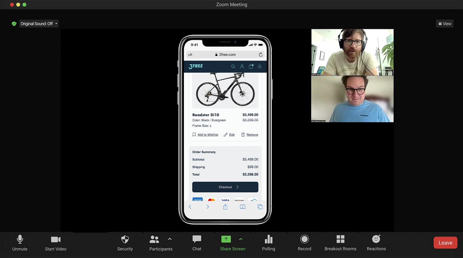
Mobile-friendly bicycle comparison
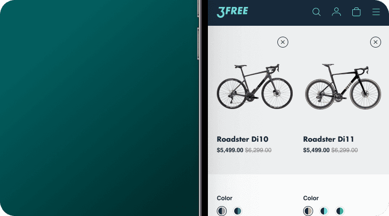
The project centered on optimizing the mobile experience. Using a phone's vertical layout, I crafted a product comparison page that presents detailed information at a glance, enabling users to make quick, informed decisions without feeling overwhelmed.

High-Fidelity Usability Testing
Could this be a smooth ride?
With the High Fidelity plotted, I led five interviews (two remote and three in-person) with people who fit the target persona markers.
What was tested
Scenario 1
Comparison
Users were asked to compare two bike products for a thorough review.
Scenario 2
Guest Checkout and purchase
Users were asked to select a product and purchase it using the platform assuming they were new to 3Free and had no preexisting account.
The Results
A total bike crash
My optimism about receiving a successful reaction was quickly curbed by much-needed critiques. I admit I had gotten too close to the UI—my desire for visual quality overpowered my intent to design for the user. The human-centered pursuit was given a second seat and my interviewees made that known. The users exposed gaps in my approach, reminding me that clarity and simplicity must guide the experience, not my aesthetic preferences.
"The product comparison process felt out of sync, especially with the extra step that seemed to come out of nowhere—it felt disjointed."

Kyle
"Figuring out which button to press during checkout was more confusing than it should’ve been—it left me second-guessing what to do next."

Andrew
With harsh but helpful feedback in hand, I returned to the High-Fidelity, focusing on the basics of UX heuristics. My edits aimed at a more confident and seamless user experience
High-Fidelity Edits
Shredding weight for a faster ride
I dove into two areas to correct the path of travel for users, making the experience easy to understand and navigate.


Slide to view Changes
High Fidelity Testing 2.0
Dialing in the tire pressure
The second round of testing showed that the 3Free mobile site is easier to use and got great feedback for its logical flow. Improvements like the updated comparison tool and simplified checkout process really stood out. These changes made the experience smoother and boosted satisfaction.
Insights
Great rides made better
User feedback underscored the need for intuitive, human-centered design.
Early usability testing revealed the gaps between design intent and real-world functionality. Users expressed dissatisfaction with elements that felt more aesthetic than practical. Iterating on these insights, the design evolved to prioritize clarity and simplicity, ensuring the experience aligned more closely with users’ expectations and reduced cognitive load.
Small changes create a big impact on trust and flow.
Adjustments like integrating OS-level email recall, refining button hierarchy, and enhancing product comparison tools impacted user satisfaction. These targeted changes not only streamlined the shopping experience but also reinforced trust in 3Free’s brand by showing a commitment to understanding and effectively addressing user needs.
Intrigued?
Try out 3Free’s mobile prototype

Tap “Enter website” to run the High-Fidelity Figma Prototype
Project Take Aways
Informed intent or bust
Informed design decisions
drive results.
Design isn’t just about aesthetics—it’s about functionality. Talking directly to the target audience revealed insights I couldn’t uncover through secondary research.
Simplification is key to usability.
Simplifying design reduces friction and enhances focus. Thoughtful changes create seamless, trusted experiences that satisfy users.
P.E.T. Design: Words matter as much as graphics.
Design is about both visuals and words. The right copy transforms frustration into clarity, making the experience effortless and empowering.
Brand awareness and identity are critical.
In niche markets, trust is everything. A strong brand presence, reflected in every detail, drives user engagement.