
March 4, 2025 · 3min
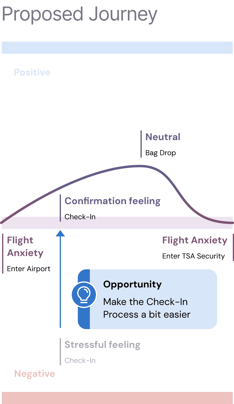
You’ve just stepped into the airport, rolling suitcase in tow, mentally prepped for the journey ahead. First stop? Check-in. You walk up to the kiosk, ready to breeze through—until it asks for your confirmation number. And just like that, mild panic sets in.
Wait, where is it? Is it in your email? Did you get a text? Maybe it’s in the app? You did check in already… right? You dig through your phone, flipping between apps, inboxes, and messages, feeling that all-too-familiar airport anxiety creep in.
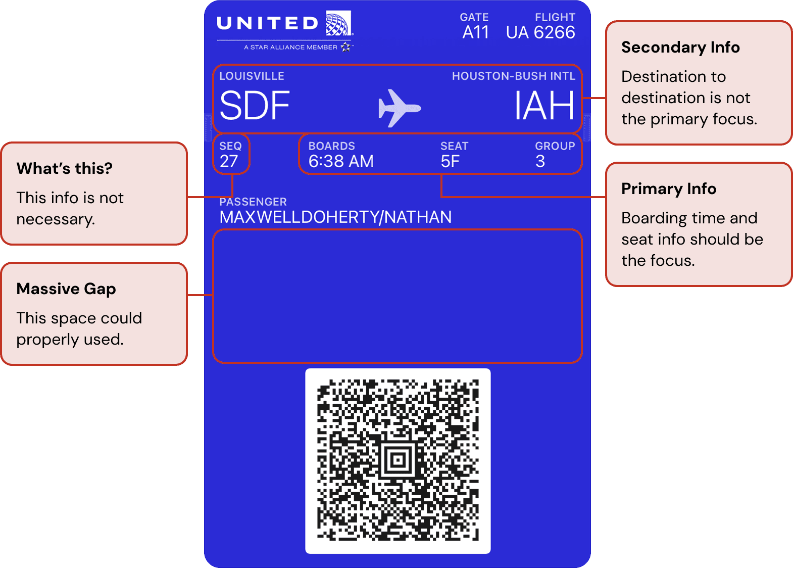
Here’s the thing— iOS native airline tickets are designed practically, yet there’s something missing… the confirmation number. The one piece of information you actually need at this moment, is nowhere to be found. Instead, your digital ticket prominently displays the departure and arrival cities (which you already know) while burying critical details in small, unreadable fonts.
This isn’t just a personal frustration. It’s a design flaw. And it’s one the needs fixed.
Understanding the Traveller's Journey
The traveler’s journey begins long before arriving at the airport, but the check-in process is a defining moment. A smooth experience here sets a positive tone for the entire trip. But when users struggle to find the one piece of information required to move forward, stress levels spike.
At this point, passengers need quick access to essential details: flight time, gate number, seat assignment, and—above all—the confirmation number. Yet, many digital boarding passes prioritize aesthetics over function, relegating crucial details to tiny fonts or obscure placements.

Redesigning with User Needs at the Forefront
I redesigned United Airlines’ iOS boarding pass with one goal in mind: make check-in seamless.

1. Prioritizing Essential Information
The confirmation number is now immediately visible at the top of the ticket, displayed in a bold, easy-to-read font. No more frantic searching. Flight details—departure, arrival, gate, and seat—follow in a clear hierarchy, emphasizing what matters most.
2. Simplified Layout
Good design is about removing friction. Cluttered graphics and unnecessary details were stripped away, leaving a clean, user-friendly layout. Passengers can now scan their ticket and instantly find what they need.
3. Consistency Across Platforms
Your confirmation number should be in the same place across your email, the app, and your digital boarding pass. This redesign ensures seamless integration, so you’re never left second-guessing where to look.

A great design doesn’t just look good—it works for the user. By rethinking the hierarchy of a boarding pass, I was able to remove an unnecessary moment of stress from the travel experience. Prioritizing essential details, decluttering the layout, and ensuring consistency across platforms transformed a small but significant pain point into a smoother, more intuitive process.
The best designs aren’t just about making things prettier. They make life easier.


